Les rdv de Camille | Agen

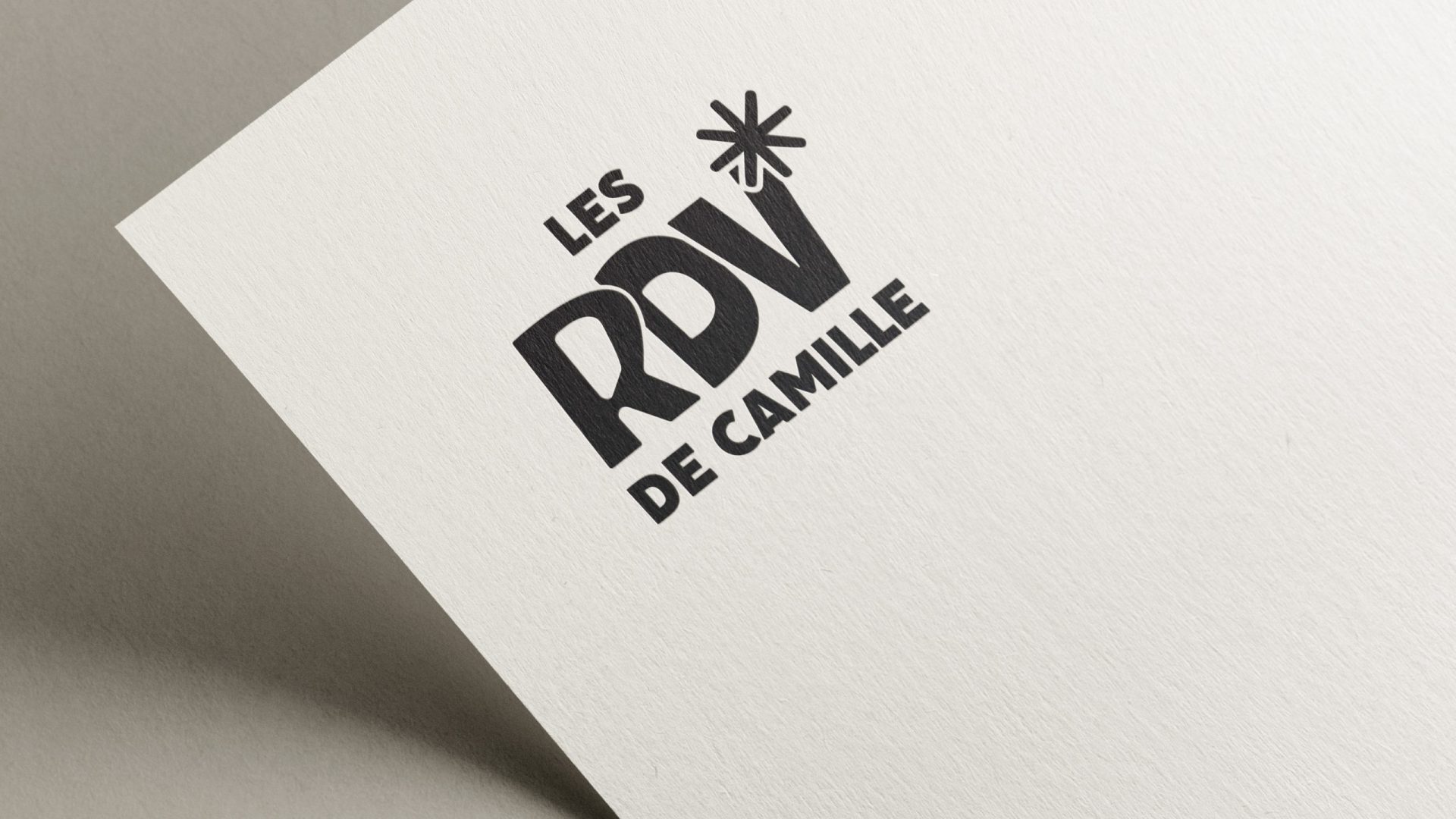
logo les rdv de camille imprimé en noir sur papier epais

CULTURE

• Artistic direction
• Graphic design
• Print

2026

Les RDV de Camille

Visual identity & event communications

The missed appointment

Camille D. has been given the opportunity to book artists for a concert venue in Agen with a clear objective: to refresh the programme, inject some energy and build an audience. What was needed was an identity that embodied this change of direction – not a corporate logo, but a vibrant brand identity.

First DA arbitration: contracting the french word for meeting ‘Les Rendez-vous de Camille’ into RDV. A shortened form that gains in impact what it loses in letters: direct, memorable, modern without compromising its identity.

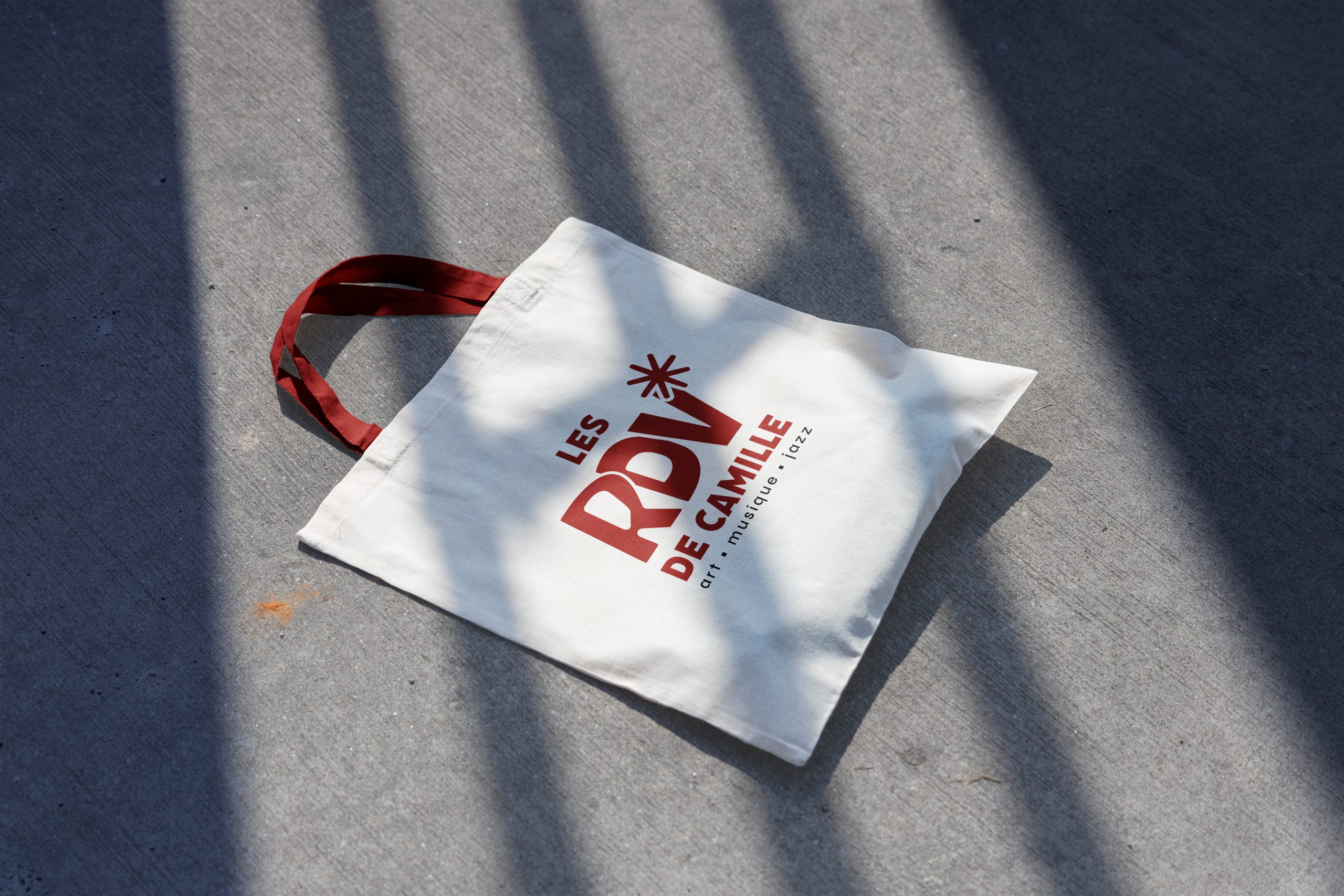
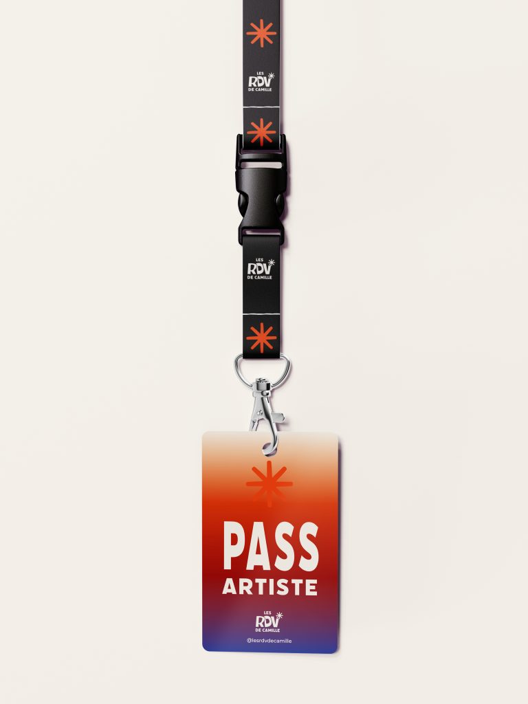
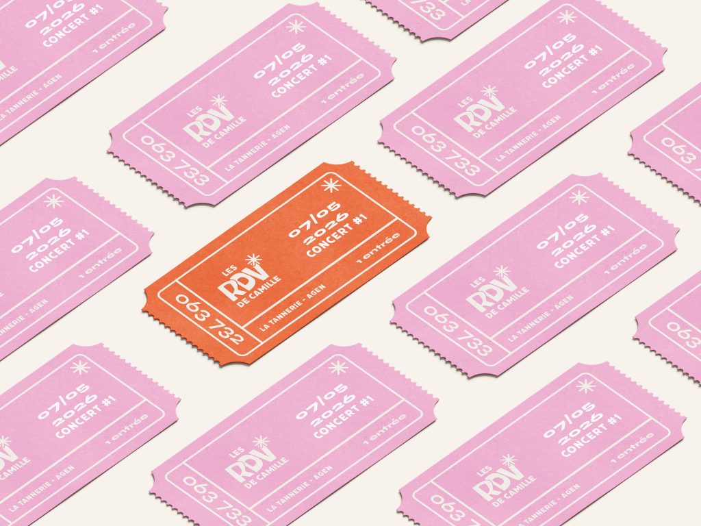
The ‘RDV’ typeface is hand-drawn and then vectorised, featuring rounded, generous shapes that instantly convey a warm, approachable feel. No institutional coldness. The star crowning the V is the signature element: simple, recognisable, and infinitely adaptable across all media. This element evokes celebration, the moment, the event, without needing to spell it out.

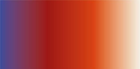
Six colours, one energy. Midnight black and creamy white as a base, deep red, vibrant orange, summer pink and velvet blue as accents. A palette that rejects a one-size-fits-all approach and adapts to every concert, every exhibition, every programming theme, whilst remaining instantly recognisable.

The typeface used for the headings features organic shapes that echo the logo design.
For text, a typeface with a range of weights, from regular to extra bold, to create a clear and dynamic hierarchy on posters and promotional materials.

étoile-bleue-velours
étoile-rose-été
étoile-rouge-profond
dégradé qui reprend la colorimétrie des rdv de Camille - Agen

Thanks to Camille and Justine for this project.

Do you have a project?

I can discuss this with you ↓

Scroll to Top