
From 2023 to 2025, I was Communications Officer at ATECH, a French manufacturer of street furniture and urban greening solutions.
This SME visual identity redesign played out on two levels: modernising the ATECH identity,
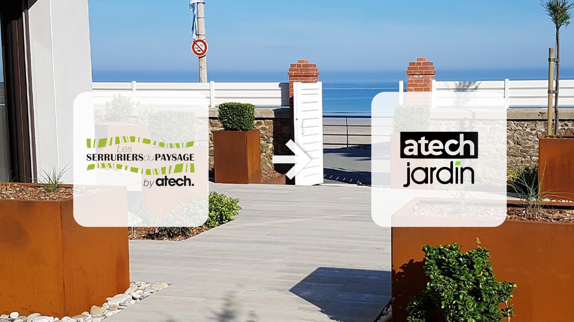
then leading the rebrand of Les Serruriers du Paysage into ATECH Jardin.
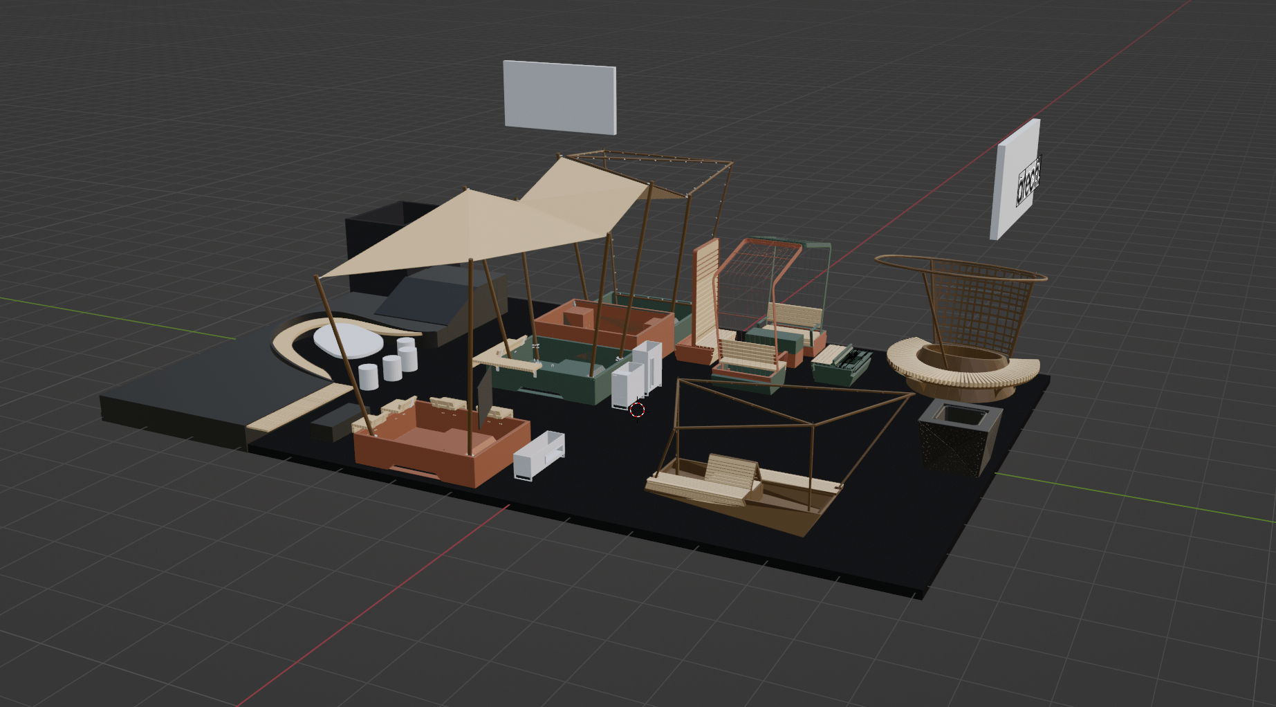
I also supervised the redesign of an e-commerce site, created the 2025 catalogue and designed a 3D stand concept for a trade show.
INDUSTRY
• Organisation / Management
• Graphic design
• Communications
• E-commerce site management
and development
• Video
2023 – 2025
ATECH: visual identity redesign for an industrial SME and the ATECH Jardin rebrand
A COMPANY READY TO EVOLVE
ATECH wanted to evolve its image, its websites and its sales tools. My work was therefore built around one objective: showcasing the company’s expertise by developing communications that were more consistent, more visible and better structured.
Visual identity redesign: modernising ATECH, repositioning ATECH Jardin
An SME visual identity redesign does not always mean starting from scratch. Here, two brands called for two different responses.
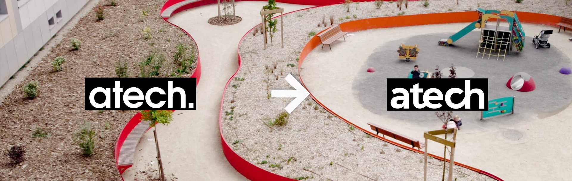
ATECH: refreshing without erasing
The aim was to refresh the brand’s graphic expression while preserving its identity and its industrial roots. This led to an evolution of the visual codes and a harmonisation of all materials.
ATECH Jardin: leading a rebrand
The brand aimed at landscapers and other landscaping professionals needed deeper work. I led the transition from Les Serruriers du Paysage to ATECH Jardin and redesigned its art direction. The goal was to make the brand identifiable as part of ATECH, so that it could benefit from the company’s recognised expertise and quality.
The 2025 catalogue: adding volume
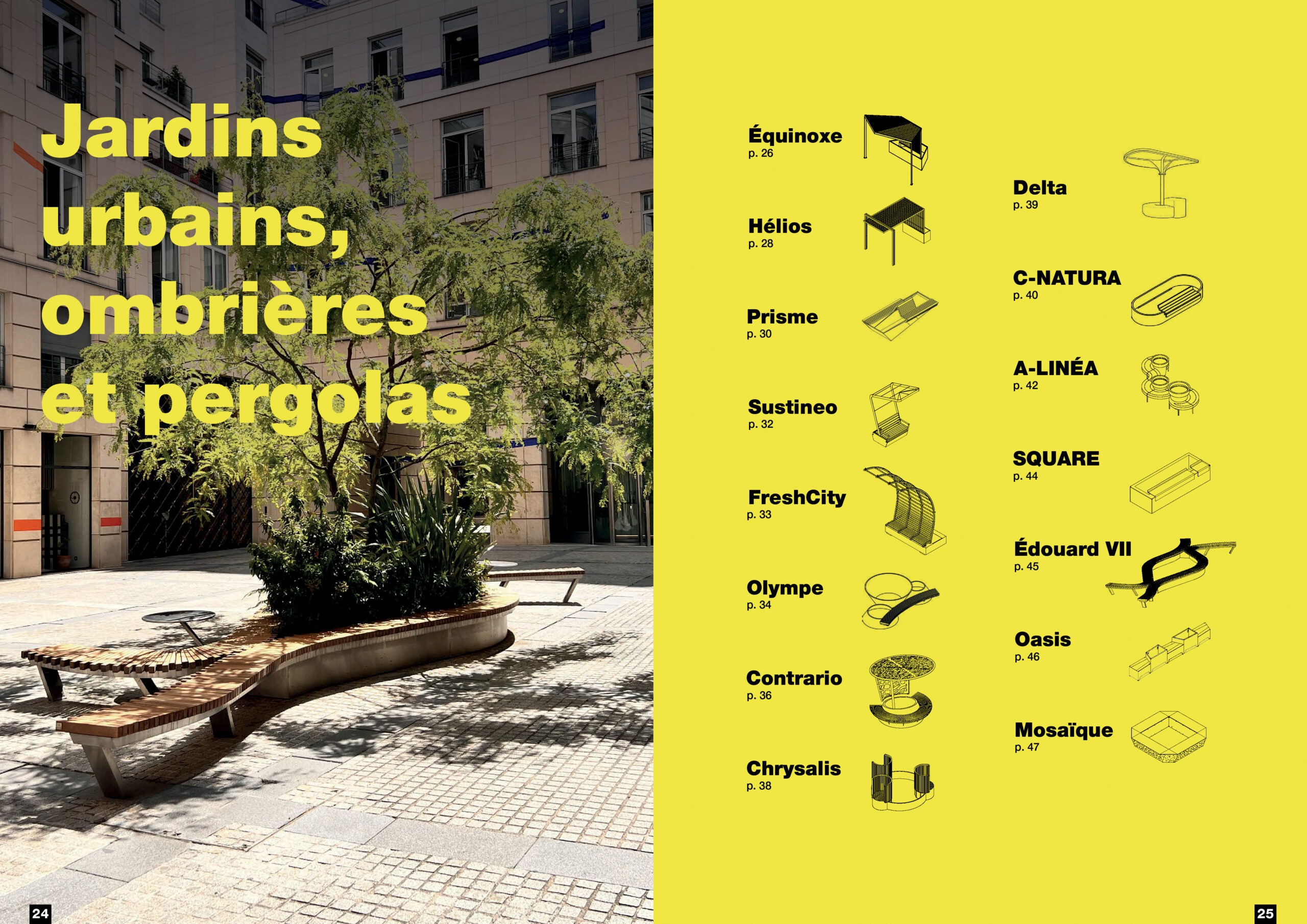
The catalogue was a central project: the new ranges had to be organised and made visual and easy to understand. It needed to give enough detail about the offer without drowning readers in information. It also had to be easy for the sales team to handle. In short, the document had to be readable, attractive and functional. The stakes were high, because all the other materials flowed from it: technical data sheets, websites, brochures, emails and social media.
Across more than 100 pages, information hierarchy, graphic composition and product presentation guided the design.
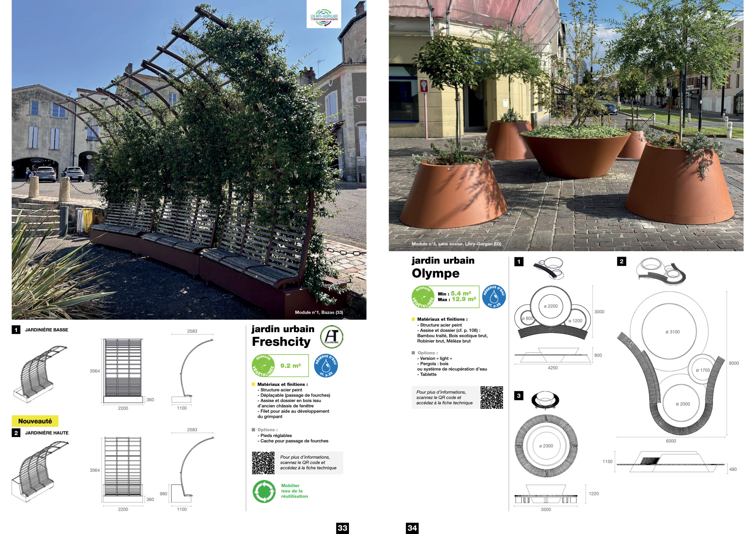
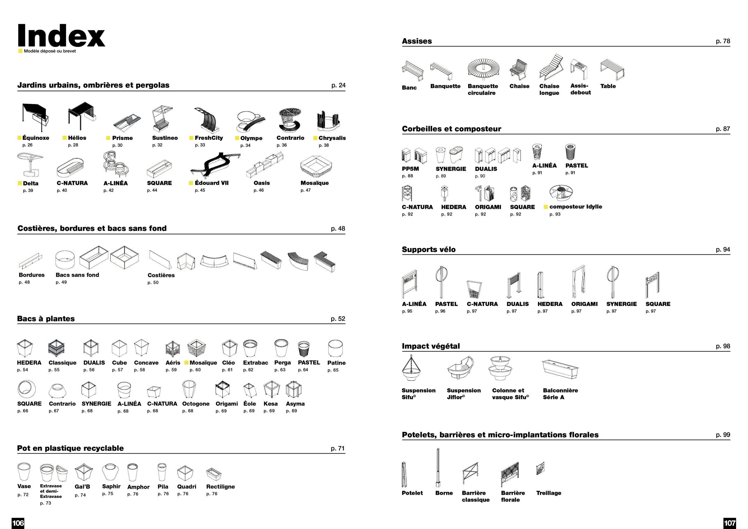
The most visible change concerns how the products are shown. Previously, they appeared only as line drawings, in front and top views: flat views that gave little sense of the real products. I introduced a three-dimensional representation in isometric perspective, so that each product now reads as an object rather than a plan.

example of the line view previously used in the catalogue and technical documents
→
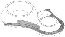
example of the isometric line view I introduced across the different materials
Alongside this, I created and improved the technical documents to make the products easier to understand, for both the teams and the customers.
Websites: from project supervision to user experience
ATECH relies on two complementary platforms: the ATECH corporate website, which presents the company’s expertise, products and completed projects, and ATECH Jardin, an e-commerce site dedicated to outdoor landscaping products.
I supervised the ATECH Jardin redesign while my manager was away.
This work also involved thinking through content structure,
the presentation of the product ranges, the user experience and the way the commercial offer was showcased.
Multiple communication channels
The aim was to direct audiences to product pages and website articles. Our editorial calendar covered a wide range of events and audiences: the Villes et Villages Fleuris competition, the seasons, municipal elections and trade shows. Each communication action was planned according to the monthly objectives.
- Social media: account management and growth
- Email marketing: campaign design and database creation using the company’s CRM
- Copywriting: articles and print advertisements
- Monthly reporting: tracking of communication actions and sales
3D stand design: extending the brand into physical space
Beyond print and digital, I designed a 3D stand concept for a trade show. This meant working on how products were staged in a bespoke space, on brand visibility and on the visitor experience.
Structuring resources for the long term
Some projects went beyond immediate communication needs. In particular, I worked on a product library to centralise resources and make them easier to use internally. I also worked on developing the company’s CSR strategy and on quantifying the greenery it supplies.
What this experience brings to your projects
These two years gave me an insider’s view: I know the constraints of an SME, its deadlines and its trade-offs.
Design is not limited to producing images, either. It also structures information and makes a company’s values and actions more visible.
Today, as a freelance art director, I bring this overall vision to every project, whether it concerns visual identity or global communication strategy.
Frequently asked questions
Does an SME always need a visual identity redesign?
Not necessarily. When a brand already has an established identity, a refresh can be enough to modernise it without erasing its history. A rebrand, on the other hand, is justified when the name or image no longer serves the brand. At ATECH, the two approaches coexisted.
What is the difference between refreshing a visual identity and rebranding?
A refresh evolves a brand’s visual codes without changing its fundamentals. A rebrand goes further: it can affect the name, the art direction and the positioning, as with the move from Les Serruriers du Paysage to ATECH Jardin.
Why entrust an industrial SME's communications to an art director?
An industrial SME uses many different materials: website, catalogue, trade shows, social media. An art director keeps them all consistent, so the brand remains identifiable wherever customers encounter it.
To explore the company’s platforms: