
Lucy Khanyan American Armenian avant-garde jazz pianist and composer asked me to edit her album cover design in preparation for her digipack to go to print using her original mixed media 3D artwork.
The aim : to ensure consistency across the board and establish a coherent artistic direction.
MUSIC
• Art direction
• Graphic design
• Print
2026
EDITING THE ALBUM COVER LAYOUT
Armed with Love
By Lucy Khanyan
Clarify to reveal
Armed with Love is the new album by Lucy Khanyan, an Armenian-American pianist and composer whose musical world draws as much from avant-garde Armenian folk as from contemporary jazz. Recorded in Paris, the album brings together three artists with distinct cultural backgrounds: Lucy Khanyan on piano, French double bassist Gabriel Pierre and Brazilian drummer Isaias Alves.
Together, they create a unique musical dialogue, in which improvisation, a fusion of traditions and contemporary expression come together in a language that is both personal and universal.
The project
What Lucy already had
Lucy got in touch with me, with a mock-up of the digipak she’d already put together: it featured her own artwork, a photo from a shoot during her previous visit to Paris, and a clear vision of the album’s visual identity.
What was missing
The mock-up lacked overall coherence. Several elements coexisted without really interacting: the artwork and the photograph did not blend well, the layout could have been made more dynamic and consistent, and the colour scheme could have done with some improvements.
The request
Building on what already exists without starting from scratch, but restructuring, harmonising and refining it so that the cover finally reflects what it really is Armed with Love :
an album of great musical and emotional depth.
The work carried out
The original design combined two distinct visual worlds: the album artwork on one side, and a photograph of Lucy taken in Paris on the other. This combination created a visual tension that diluted the cover’s identity. The first decision was therefore a radical one: to remove the photograph and rely solely on the artwork. This decision immediately refocused attention on what matters most.
Next, the layout and fonts were revised to provide a clearer hierarchy of information. This makes for a smoother reading experience and ensures that the album title stands out naturally.
The text has also been repositioned to balance the layout, comply with printing requirements and guide the eye effortlessly.
Finally, the colour scheme has been completely redesigned. The grey and blue of the original version have been replaced by a combination of blue and pink, which is more in keeping with the atmosphere of the album
and Lucy’s world of jazz.
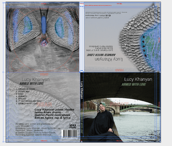
before
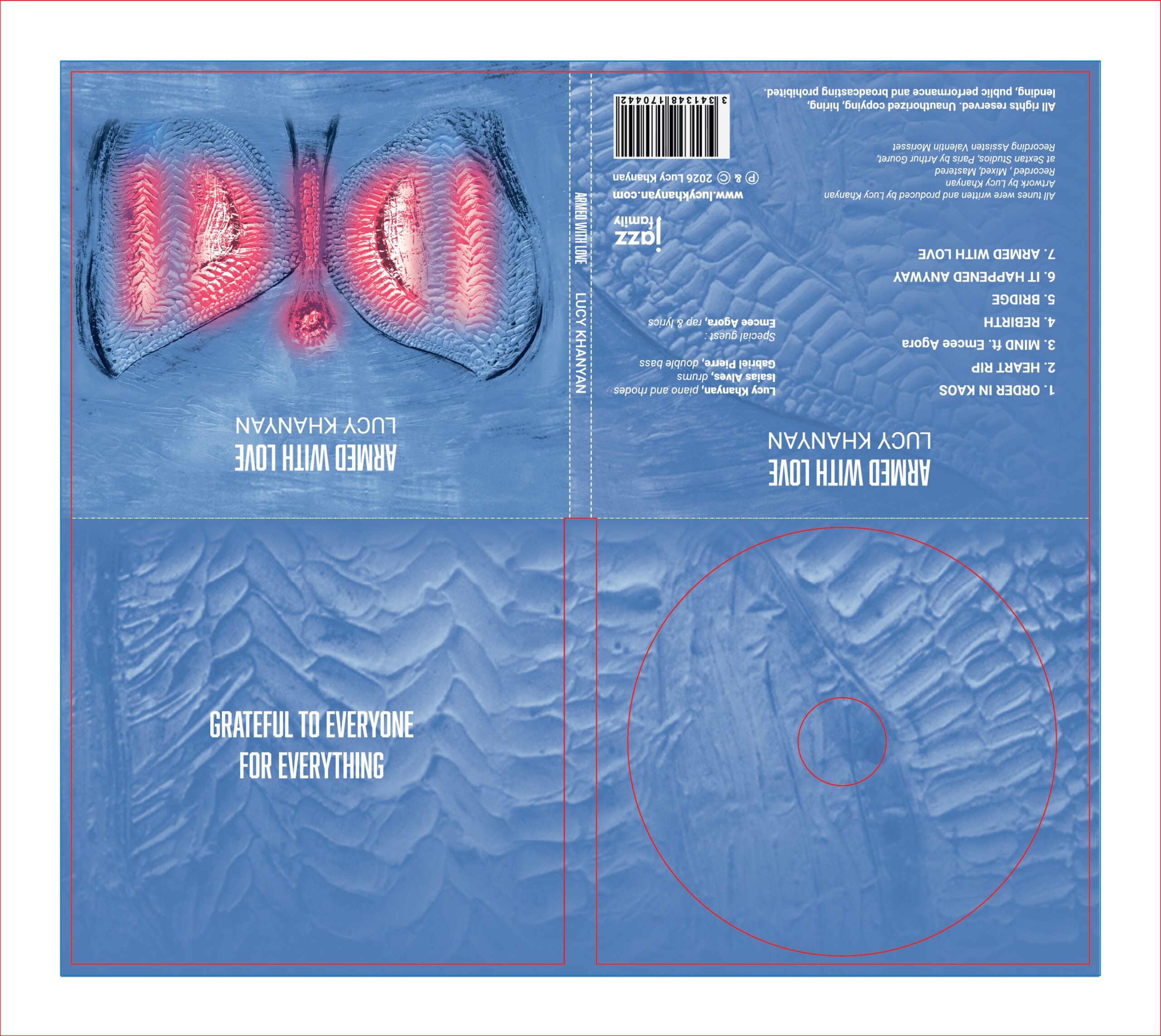
after
Typography and contrast
The first typeface is used in capital letters for the title and other information. Indeed, its straight, angular lines convey a sense of power.
The second typeface, which is rounder but just as bold, provides stability and contrast. I have used it in various forms: in capital letters only, in a very light weight, or in a heavier weight. These different applications allow me to establish a hierarchy of information and bring the layout to life.
Every typographical choice reflects elements of Lucy’s music. In short, the aim is to highlight the album’s identity whilst creating a design that is consistent with the music it contains.
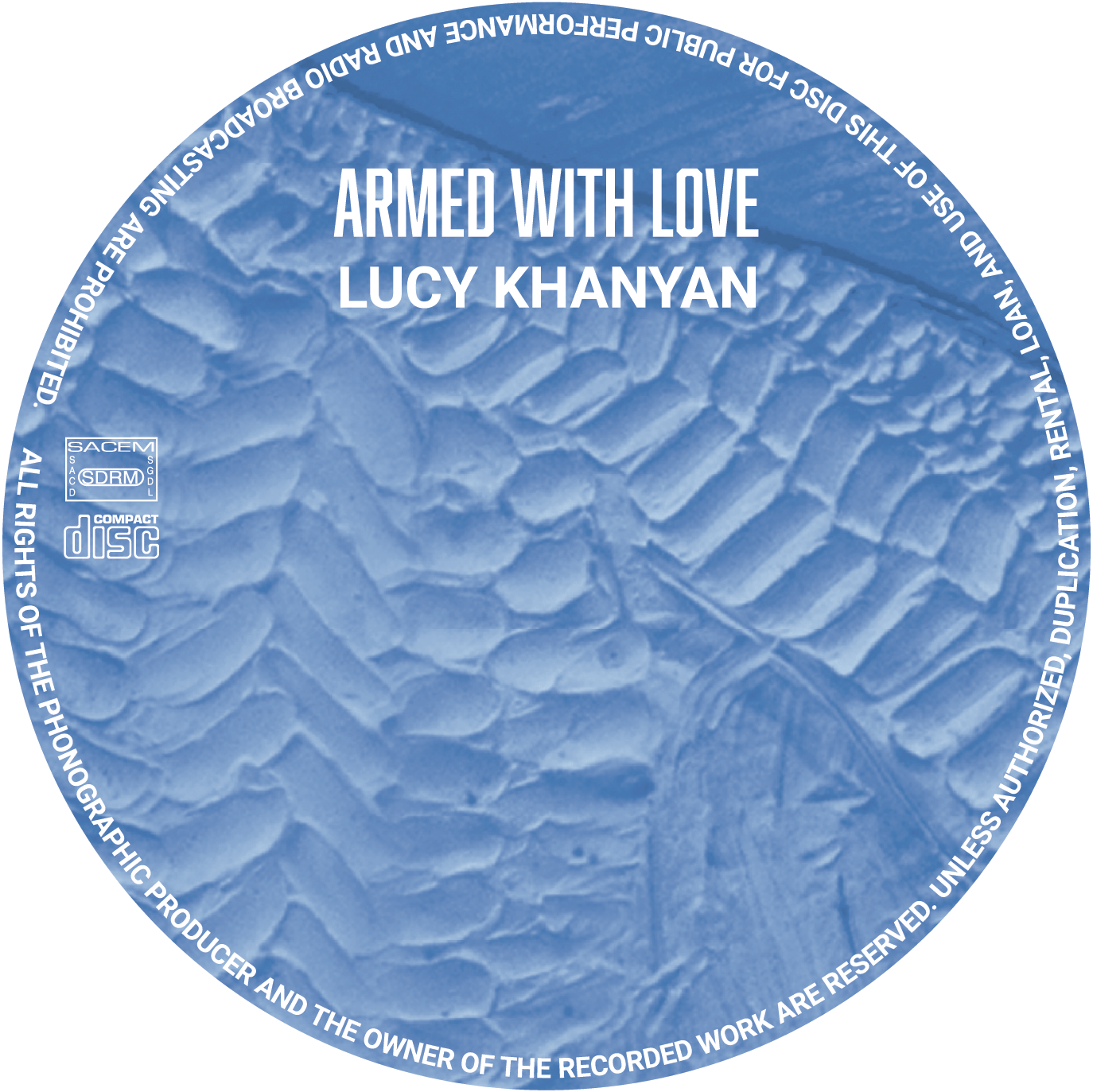
Clarify to reveal
Retouching an existing album cover design is a balancing act. It is not about imposing a new vision, but about listening to what is already there and bringing it to the fore. Every choice made on the cover ofArmed with Love answered the same question: does this element enhance the album, or does it detract from it?
Deleting the photo wasn’t the same as erasing Lucy. It was about trusting her artwork to tell her story. Revising the colours wasn’t a betrayal of her original design. It was about refining it until we found the right tone to match what the music conveys.
The result is a case that breathes.
A consistent visual identity, from the very first glance right down to the details of the digipack.
The final result
The final digipack ofArmed with Love is a cover that fully embraces its identity. The artwork fills the entire space; the blue and pink colours complement each other perfectly on the cover; and the typography guides the eye without being intrusive. Each side of the digipack forms part of a visual continuum, and each has been optimised to ensure the result is a cohesive whole, from front to back.
This project illustrates what an outside perspective can bring to a work-in-progress: not starting all over again, but refining, clarifying, and giving the whole project the impact it deserved from the outset.
Thanks to Lucy Khanyan and the label Jazz Family for this project.